The first thing I do when I have a clean data set is plot the variables (columns) as histograms. Along with the standard summary statistics, histograms give a quick overview of the distribution of the data. Sometimes the data spans several orders of magnitude, and I can't see any pattern from the histogram or the summary statistics. In these cases, the histogram of the logarithm of the data may be useful.
One downside of log-transformations is the loss of human interpretability. To maintain some interpretability, I use untransformed labels instead of the transformed labels that would appear by default.
I am using my personal Google location history data. This is my first post using this data set. There's a lot more that can be done with it, so I plan on writing more in-depth analyses in the future. A quick Google search for "google location history data" will yield countless blog posts showing you how to obtain, clean, and analyze your own location history from Google. Here's one I used.
Untransformed data
With this data set, I first wanted to understand how frequently I was being tracked. Each observation (row) has a timestamp. The difference in time between two consecutive observations will give me the time between each record. The new variable t_diff_s is the time in seconds since the previous observation, i.e. the current time minus the lag. I manually assign 0 to the first observation, since there is no previous row to subtract.
I could have also calculated the time until the next observation, i.e. the lead minus the current time, and assigned 0 to the last observation. This is a decision that comes down to how you want to interpret the data.
PTS_df$t_diff_s = PTS_df$time - lag(PTS_df$time)
PTS_df$t_diff_s[1] = 0
PTS_df$t_diff_s = as.double(PTS_df$t_diff_s)
From the summary, we can see right away t_diff_s has a very large range. Time between records is anywhere between a few milliseconds and several hours.
data.frame(min = PTS_df$t_diff_s %>% sort() %>% head(3),
           max = PTS_df$t_diff_s %>% sort() %>% tail(3))
##           min      max
## 1 0.000000000 52432.46
## 2 0.003000021 54089.61
## 3 0.005000114 68356.00
##    Min. 1st Qu.  Median    Mean 3rd Qu.    Max.
##     0.0   132.4   199.1  1400.7   585.3 68356.0
The wide range and strong right skew is seen in the histogram, too. We can also see that most observations were sampled less than 200 seconds apart.
hist(PTS_df$t_diff_s,
     breaks = 50,
     main = "Histogram of\ntime between observations",
     xlab = "time in seconds")

Transformed data
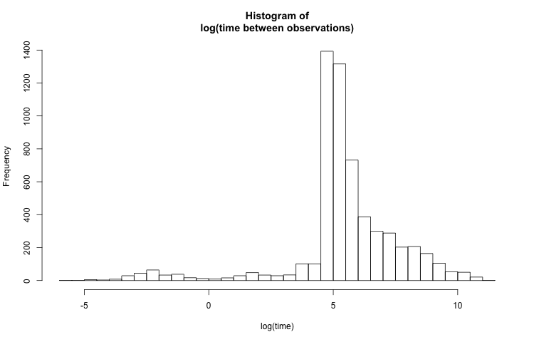
The above histogram isn't very useful because the visible time scale is on the order of a few hours. Most of the values are on the order of just a few minutes, so it would be more helpful to see the data at this granularity, while also preserving the full range. A reasonable solution would be to plot the histogram of log(t_diff_s):
hist(log(PTS_df$t_diff_s),
     breaks = 50,
     main = "Histogram of\nlog(time between observations)",
     xlab = "log(time)")

Better labels
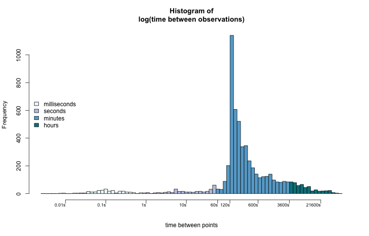
By scaling the x-axis logarithmically, smaller values are more dispersed and larger values are bunched together. The distribution looks much less skewed now, but the labels on the x-axis don't make sense. To make the axis more clear, I place labels at predetermined points with the axis() function. The location of the labels need to be log-transformed. The labels' text are untransformed.
time_hist = function(x, col = 0) {
    h = hist(log(x),
             axes = FALSE,
             main = "Histogram of\nlog(time between observations)",
             xlab = "time between points",
             col = col,
             breaks = 100)
    axis(side = 1,

         # labels at log-transformed points
         at =  log(c(0.01, 0.1, 1, 10, 60, 120, 600, 3600, 21600)),

         # text of labels is untransformed points
         labels = paste0(c(0.01, 0.1, 1, 10, 60, 120, 600, 3600, 21600), "s"),

         cex.axis = 0.75,
         padj = -2,
         hadj = 1,
         las = 1)
    axis(2)
    return(h)
}

h = time_hist(PTS_df$t_diff_s)

Now we can better interpret the distribution of t_diff_s. Most values fall between two and ten minutes (120 — 600 seconds). The most common sampling interval lengths are between 134 and 164 seconds. A few observations were taken less than one second apart. Some observations were recorded over 6 hours (21600 seconds) after the previous one.
When we think about time, especially the time that t_diff_s represents, the log-transformed histogram fits our intuition the best. There is an apparent pattern that also coincides with how we might subconsciously think about the data.
The range of the x-axis of the untransformed histogram leads us to mentally group the values into hours-long clusters. A millisecond (0.1s), 5 minutes (300s), and one hour (3600s) are all grouped together in the lowest group, while five hours (18000s) and fifteen hours (54000s) are visually separate.
While this isn't necessarily wrong, it is an unusual way to think about time. The log-transformed histogram data better shows us visual groupings that we are familiar with: milliseconds, seconds, minutes, and hours.
hcols = rep("#FFFFFF", length(h$mids))
hcols[h$mids < 0] = "#edf8fb"
hcols[h$mids >= 0] = "#bdc9e1"
hcols[h$mids >= log(60)] = "#67a9cf"
hcols[h$mids >= log(60*60)] = "#02818a"
h = time_hist(PTS_df$t_diff_s, col = hcols)
legend("left",
       legend = c("milliseconds", "seconds", "minutes", "hours"),
       fill = c("#edf8fb", "#bdc9e1", "#67a9cf", "#02818a"),
       bty = "n")

For future analyses, this information will help me determine which observations are reliable enough to keep, and which ones I can remove due to redundancy.
The code I used for this is available on my GitHub. I also included a simulated data set, timestamps.csv.
d = density(log(PTS_df$t_diff_s))

# means are directly sampled
logmeans = sample(x = PTS_df$t_diff_s, size = 1000, replace = TRUE) %>% log()
# standard deviation is the kernel bandwidth
logx = rnorm(n = 1000, mean = logmeans, sd = d$bw)

x = exp(logx)
timestamps = ymd_hms("2018-01-01 00:00:00.00") + seconds(x)
write.csv(sort(timestamps), "timestamps.csv")